popoverMenu
popoverMenu is an object within the theme property for overriding all pop over menus.
<Vizzly.Dashboard
  // ...
  theme={{
    popoverMenu: {
      background: "#f9f7fa",
      color: "inherit",
      separatorBorder: "none",
      "&:hover": {
        background: "#ffffff",
        color: "inherit",
      },
    },
  }}
/>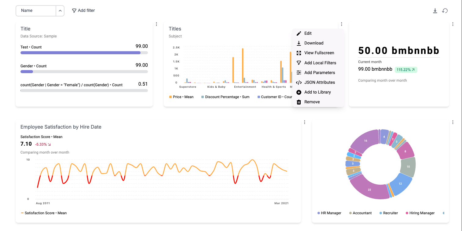
Pop Over Menus
Pop Over Menus are featured within <Vizzly.Dashboard/> in the following loctions:
- Dropdowns shown on click of more buttons, shown to the right of dashboard cells.
- Dropdowns shown on click of table header cells.
- Dropdowns shown on click of more buttons, shown to the right of Views in the View Library.
- Dropdowns shown on click of the local filters funnel icon, shown on Views.
Default Values
import Vizzly, { type VizzlyTheming } from "@vizzly/dashboard"

export function Dashboard() {
  const theme: VizzlyTheming.Base = {
    popoverMenu: {
      // Default Values
      background: "#f9f7fa",
      color: "inherit",
      boxShadow: "0 0 #0000, 0 0 #0000, 0 10px 15px -3px rgb(0 0 0 / 0.1), 0 4px 6px -4px rgb(0 0 0 / 0.1)",
      fontSize: "14px",
      fontWeight: "inherit",
      separatorBorder: "none",
      borderRadius: "8px",
      padding: "0.35rem 0.75rem",
      "&:hover": {
        background: "#ffffff",
        fontWeight: "inherit",
        color: "inherit",
      },
    },
  }

  return (
    <Vizzly.Dashboard
      // ...
      theme={theme}
    />
  )
}