filters
filters is an object within the theme property for overriding dashboard 'Add filter' button styles.
<Vizzly.Dashboard
  // ...
  theme={{
    filters: {
      filterBy: {
        background: "#fff",
        "&:hover": {
          background: "#E9EBF0",
          opacity: 0.7,
        },
      },
    },
  }}
/>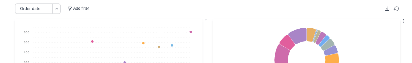
Filters
'Add filter' buttons are shown at the top left of <Vizzly.Dashboard/>. To override styles for the modal shown when 'Add filter' buttons are clicked, use modals.
Default Value
import Vizzly, { type VizzlyTheming } from "@vizzly/dashboard"

export function Dashboard() {
  const theme: VizzlyTheming.Base = {
    filters: {
      // Default Value
      filterBy: {
        background: "#fff",
        border: "0",
        borderRadius: "8px",
        boxShadow: "unset",
        color: "#374151",
        fontSize: 14,
        fontWeight: 500,
        height: "auto",
        padding: "0.45rem 1rem 0.46rem",
        "&:hover": {
          background: "#E9EBF0",
          border: "0",
          borderRadius: "8px",
          boxShadow: "unset",
          color: "#374151",
          fontWeight: 500,
          opacity: 0.7,
        },
        "&:disabled": {
          background: "#fff",
          border: "0",
          borderRadius: "8px",
          boxShadow: "unset",
          color: "#374151",
          fontWeight: 500,
          opacity: 0.7,
        },
        "&:hover:disabled": {
          background: "#fff",
          border: "0",
          borderRadius: "8px",
          boxShadow: "unset",
          color: "#374151",
          fontWeight: 500,
          opacity: 0.7,
        },
      },
    },
  }

  return (
    <Vizzly.Dashboard
      // ...
      theme={theme}
    />
  )
}