customViews
Description
Static Custom Views
This allows you to add custom views in a specific location on the dashboard.
Types
export type BaseCustomView = {
  id: string;
};

export type StaticCustomView = BaseCustomView & {
  /* The index of the row where the component will be placed. */
  rowIndex: number;
  /* The index of the cell where the component will be placed. */
  cellIndex: number;
  /* The component to render.
  The component can be a React component or a string.
  */
  Component: (params: CustomViewCallbackParams) => JSX.Element | string;
  /* The options for the component. */
  options?: {
    /* Disable the ability to add a cell to a row where the component is placed. */
    disableAddCell?: boolean;
    /* Removes the Panel that contains the component. */
    raw?: boolean;
  };
  /* The attributes for the component. */
  attributes?: {
    /* The title of the component. */
    displayTitle?: string;
    /* The subject of the component. */
    displaySubject?: string;
  };
};<Vizzly.Dashboard
customViews={[
{
id: '<< A UNIQUE ID >>',
Component: () => <div>Custom view</div>,
rowIndex: 0,
cellIndex: 0,
},
]}
/>Selectable Custom Views
These will appear in the Views dropdown in the Editor and can be selected. They can place them anywhere on the dashboard.
It's currently not possible for the end user to add properties to these components.
Types
export type BaseCustomView = {
  id: string;
};

export type SelectableCustomView = BaseCustomView & {
  title: string;
  Icon: () => JSX.Element;
  Component: (params: CustomViewCallbackParams) => JSX.Element | string;
};<Vizzly.Dashboard
customViews={[
{
id: '<< A UNIQUE ID >>',
Component: () => <div>Custom view</div>,
title: '<< A TITLE >>',
Icon: () => <div style={{ width: 20, height: 20 }} />,
},
]}
/>Using the property with Vizzly Query Engine
The Component in the Custom View makes available dashboardFilters, this contains the selected filters on the dashboard.
If you want your component to behave based on what the user has selected you can pass this into your query and it will only
return data that matches the filters.
You can use the customViews in conjunction with the query API to build your own custom components.
Types
export type DataSetDashboardFilters = { [dataSetId: string]: QueryAttributes.Filter[][] };

export type CustomViewCallbackParams = {
  dashboardFilters: DataSetDashboardFilters;
  attributes?: Component.CustomViewAttributes;
};
Example
Make sure both @vizzly/services and @vizzly/dashboard packages are installed.
import React, { Fragment, useEffect, useState } from 'react';
import { Dashboard } from '@vizzly/dashboard';
import { QueryResponse, Vizzly } from '@vizzly/services';

export default () => {
  const [vizzlyLoaded, setVizzlyLoaded] = useState<boolean>(false);

  useEffect(() => {
    async function initializeVizzly() {
      try {
        await Vizzly.load({
          queryEngine: 'https://example.vizzly.co/query-engine',
          identity: getIdentity('new_user'),
        });
        const instance = await Vizzly.waitToUse();
        setVizzlyLoaded(!!instance);
      } catch (err) {
        console.error(err);
      }
    }

    initializeVizzly();
  }, []);

  if (!vizzlyLoaded) {
    return <div>Loading...</div>;
  }

  return (
    <Dashboard
      customViews={[
        {
          id: 'string',
          Component: (params: CustomViewCallbackParams) => (
            // In your code, add a component like we have in this example with CustomView.
            <CustomChart dashboardFilters={params?.dashboardFilters} />
          ),
          rowIndex: 1,
          cellIndex: 1,
        },
      ]}
    />
  );
};

const CustomChart: FunctionComponent<{ dashboardFilters: DataSetDashboardFilters }> = ({ dashboardFilters }) => {
  const [componentResponse, setComponentResponse] = useState<QueryResponse | null>(null);

  useEffect(() => {
    const doSomething = async () => {
      const vizzly = Vizzly.use();
      const response: QueryResponse = await vizzly.query(
        [
          {
            filter: [],
            measure: [
              {
                field: 'fie_1',
                function: 'sum',
              },
            ],
            dimension: [
              {
                field: 'fie_1',
                function: 'none',
                pivot: 'x',
              },
            ],
            timeDimension: null,
            dataSetId: 'data_set_1',
            order: [],
            limit: 5000,
          },
        ],
        // here we pass in the dashboardFilters brought in from the parent component
        // and used in your custom query.
        { dashboardFilters }
      );
      setComponentResponse(response);
    };

    doSomething();
  }, [dashboardFilters]);

  if (componentResponse === null) return <div>Loading...</div>;

  return <div>{JSON.stringify(componentResponse.results)}</div>;
};
Examples Gallery
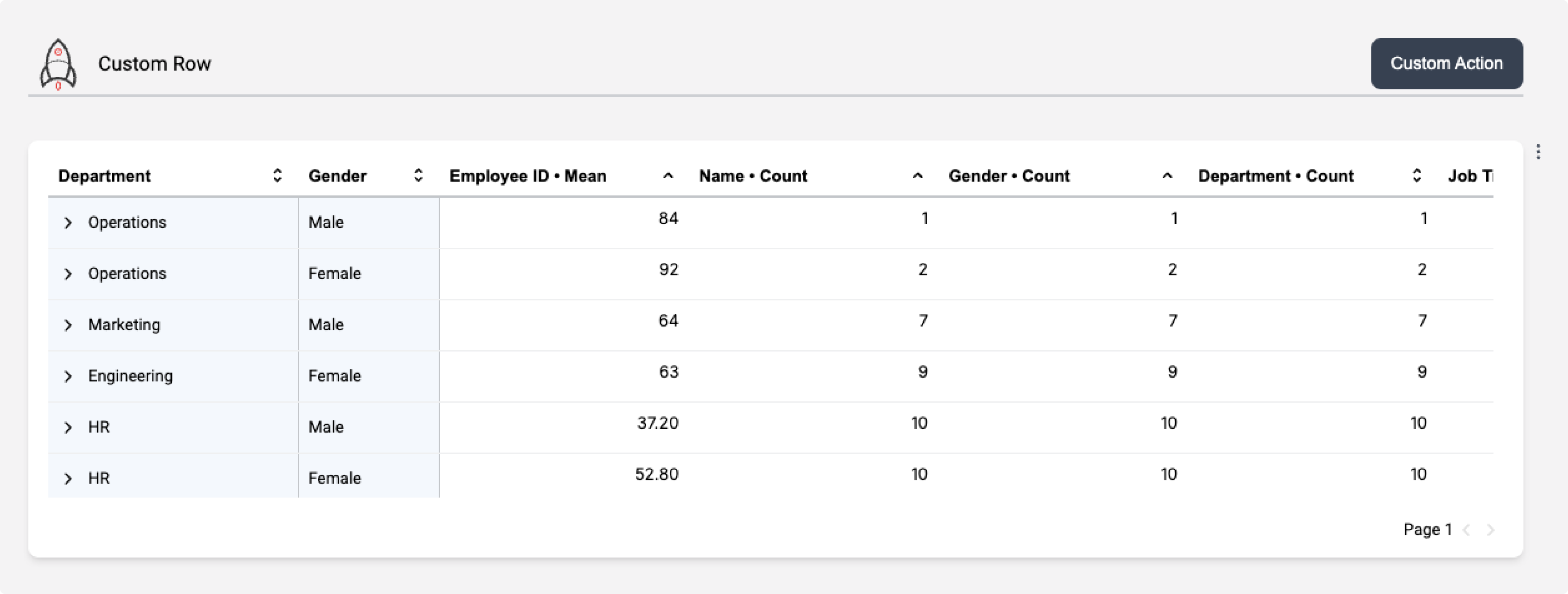
Customised Header Row
Create a header row or action bar using the customViews property. It allows you to match your current design guidelines to create a consistent experience.
<Vizzly.Dashboard
  customViews={[
    {
      id: 'row-header',
      Component: () => (
       <div
          style={{
            display: 'flex',
            alignItems: 'center',
            width: '100%',
            justifyContent: 'space-between',
            borderBottom: '2px solid #cdcfd3',
          }}
        >
          <div style={{ display: 'flex', alignItems: 'center', gap: '0.5rem' }}>
            <span>
              <svg
                width="48px"
                height="48px"
                viewBox="0 0 1024 1024"
                className="icon"
                version="1.1"
                xmlns="http://www.w3.org/2000/svg"
              >
                <path d="M512 301.2m-10 0a10 10 0 1 0 20 0 10 10 0 1 0-20 0Z" fill="#E73B37" />
                <path
                  d="M400.3 744.5c2.1-0.7 4.1-1.4 6.2-2-2 0.6-4.1 1.3-6.2 2z m0 0c2.1-0.7 4.1-1.4 6.2-2-2 0.6-4.1 1.3-6.2 2z"
                  fill="#39393A"
                />
                <path
                  d="M511.8 256.6c24.4 0 44.2 19.8 44.2 44.2S536.2 345 511.8 345s-44.2-19.8-44.2-44.2 19.9-44.2 44.2-44.2m0-20c-35.5 0-64.2 28.7-64.2 64.2s28.7 64.2 64.2 64.2 64.2-28.7 64.2-64.2-28.7-64.2-64.2-64.2z"
                  fill="#E73B37"
                />
                <path
                  d="M730.7 529.5c0.4-8.7 0.6-17.4 0.6-26.2 0-179.6-86.1-339.1-219.3-439.5-133.1 100.4-219.2 259.9-219.2 439.5 0 8.8 0.2 17.5 0.6 26.1-56 56-90.6 133.3-90.6 218.7 0 61.7 18 119.1 49.1 167.3 30.3-49.8 74.7-90.1 127.7-115.3 39-18.6 82.7-29 128.8-29 48.3 0 93.9 11.4 134.3 31.7 52.5 26.3 96.3 67.7 125.6 118.4 33.4-49.4 52.9-108.9 52.9-173.1 0-85.4-34.6-162.6-90.5-218.6zM351.1 383.4c9.2-37.9 22.9-74.7 40.6-109.5a502.1 502.1 0 0 1 63.6-95.9c17.4-20.6 36.4-39.9 56.8-57.5 20.4 17.6 39.4 36.9 56.8 57.5 24.8 29.5 46.2 61.8 63.6 95.9 17.7 34.8 31.4 71.6 40.6 109.5 8.7 35.8 13.5 72.7 14.2 109.9C637.4 459 577 438.9 512 438.9c-65 0-125.3 20.1-175.1 54.4 0.7-37.2 5.5-74.1 14.2-109.9z m-90.6 449.2c-9.1-27-13.7-55.5-13.7-84.4 0-35.8 7-70.6 20.8-103.2 8.4-19.8 19-38.4 31.9-55.5 9.7 61.5 29.5 119.7 57.8 172.6-36.4 17.8-69 41.6-96.8 70.5z m364.2-85.3c-0.7-0.3-1.5-0.5-2.2-0.8-0.4-0.2-0.9-0.3-1.3-0.5-0.6-0.2-1.3-0.5-1.9-0.7-0.8-0.3-1.5-0.5-2.3-0.8-0.8-0.3-1.5-0.5-2.3-0.7l-0.9-0.3c-1-0.3-2.1-0.7-3.1-1-1.2-0.4-2.4-0.7-3.5-1.1l-3-0.9c-0.2-0.1-0.4-0.1-0.7-0.2-1.1-0.3-2.3-0.7-3.4-1-1.2-0.3-2.4-0.6-3.5-0.9l-3.6-0.9-3.6-0.9c-1-0.3-2.1-0.5-3.1-0.7-1.2-0.3-2.4-0.5-3.6-0.8-1.3-0.3-2.5-0.6-3.8-0.8h-0.3c-0.9-0.2-1.9-0.4-2.8-0.6-0.4-0.1-0.7-0.1-1.1-0.2-1.1-0.2-2.2-0.4-3.4-0.6-1.2-0.2-2.4-0.4-3.6-0.7l-5.4-0.9c-0.9-0.1-1.9-0.3-2.8-0.4-0.8-0.1-1.6-0.3-2.5-0.4-2.6-0.4-5.1-0.7-7.7-1-1.2-0.1-2.3-0.3-3.5-0.4h-0.4c-0.9-0.1-1.8-0.2-2.8-0.3-1.1-0.1-2.1-0.2-3.2-0.3-1.7-0.2-3.4-0.3-5.1-0.4-0.8-0.1-1.5-0.1-2.3-0.2-0.9-0.1-1.9-0.1-2.8-0.2-0.4 0-0.8 0-1.2-0.1-1.1-0.1-2.1-0.1-3.2-0.2-0.5 0-1-0.1-1.5-0.1-1.3-0.1-2.6-0.1-3.9-0.1-0.8 0-1.5-0.1-2.3-0.1-1.2 0-2.4 0-3.5-0.1h-13.9c-2.3 0-4.6 0.1-6.9 0.2-0.9 0-1.9 0.1-2.8 0.1-0.8 0-1.5 0.1-2.3 0.1-1.4 0.1-2.8 0.2-4.1 0.3-1.4 0.1-2.7 0.2-4.1 0.3-1.4 0.1-2.7 0.2-4.1 0.4-0.6 0-1.2 0.1-1.8 0.2l-7.8 0.9c-1.1 0.1-2.1 0.3-3.2 0.4-1 0.1-2.1 0.3-3.1 0.4-3.2 0.5-6.4 0.9-9.5 1.5-0.7 0.1-1.4 0.2-2.1 0.4-0.9 0.1-1.7 0.3-2.6 0.5-1.1 0.2-2.3 0.4-3.4 0.6-0.9 0.2-1.7 0.3-2.6 0.5-0.4 0.1-0.8 0.1-1.1 0.2-0.7 0.1-1.4 0.3-2.1 0.4-1.2 0.3-2.4 0.5-3.6 0.8-1.2 0.3-2.4 0.5-3.6 0.8-0.2 0-0.4 0.1-0.6 0.1-0.5 0.1-1 0.2-1.5 0.4-1.1 0.3-2.3 0.6-3.5 0.9-1.3 0.3-2.5 0.6-3.8 1-0.4 0.1-0.9 0.2-1.4 0.4-1.3 0.4-2.7 0.7-4 1.1-1.5 0.4-3 0.9-4.6 1.3-1 0.3-2.1 0.6-3.1 1-2.1 0.6-4.1 1.3-6.2 2-0.7 0.2-1.4 0.5-2.1 0.7-15-27.5-27.4-56.4-37-86.2-11.7-36.1-19.2-73.6-22.5-111.6-0.6-6.7-1-13.3-1.3-20-0.1-1.2-0.1-2.4-0.1-3.6-0.1-1.2-0.1-2.4-0.1-3.6 0-1.2-0.1-2.4-0.1-3.6 0-1.2-0.1-2.4-0.1-3.7 18.8-14 39.2-25.8 61-35 36.1-15.3 74.5-23 114.1-23 39.6 0 78 7.8 114.1 23 21.8 9.2 42.2 20.9 61 35v0.1c0 1 0 1.9-0.1 2.9 0 1.4-0.1 2.8-0.1 4.3 0 0.7 0 1.3-0.1 2-0.1 1.8-0.1 3.5-0.2 5.3-0.3 6.7-0.8 13.3-1.3 20-3.3 38.5-11 76.5-23 113-9.7 30.3-22.3 59.4-37.6 87.1z m136.8 90.9a342.27 342.27 0 0 0-96.3-73.2c29.1-53.7 49.5-112.8 59.4-175.5 12.8 17.1 23.4 35.6 31.8 55.5 13.8 32.7 20.8 67.4 20.8 103.2 0 31-5.3 61.3-15.7 90z"
                  fill="#39393A"
                />
                <path
                  d="M512 819.3c8.7 0 24.7 22.9 24.7 60.4s-16 60.4-24.7 60.4-24.7-22.9-24.7-60.4 16-60.4 24.7-60.4m0-20c-24.7 0-44.7 36-44.7 80.4 0 44.4 20 80.4 44.7 80.4s44.7-36 44.7-80.4c0-44.4-20-80.4-44.7-80.4z"
                  fill="#E73B37"
                />
              </svg>
            </span>
            <h3>
              Custom Row
            </h3>
          </div>
          <div>
            <button>Custom Action</button>
          </div>
        </div>
      ),
      rowIndex: 5,
      cellIndex: 0,
      options: {
        disableAddCell: true,
        raw: true,
      },
    },
  ]}
/>